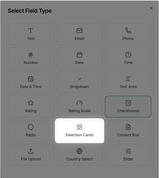
Selection Cards
Learn how to use selection cards in GenZform for visually appealing choices with images and descriptions.
Selection cards are visually appealing selection options that include titles and optional descriptions. They make your forms more engaging and easier to understand.
When to Use Selection Cards
Selection cards work best for:
- Plan or pricing tier selection
- Category selection
- Visual preference questions
- Any choice that benefits from descriptive options
Selection cards currently support text-based cards only. Image support is planned for a future update.
How to Add Selection Cards
Ask the AI in the chat panel:
Example prompts:
- "Add selection cards for subscription plans"
- "Create cards with titles and descriptions for each option"
- "Include selection cards for 'Choose your plan'"
Selection Card Properties
| Property | Description | Example |
|---|---|---|
| Options | List of cards | Cards with titles |
| Title | Card heading | "Basic Plan" |
| Description | Additional text | "Perfect for individuals" |
Customization Options
Descriptions
"Include descriptions under each card title"Pricing Information
"Show prices on each card: Basic $9, Pro $29, Enterprise $99"Common Use Cases
Plan Selection
Subscription tiers with features and pricingCategory Selection
"What type of project is this?" with category optionsPreference Questions
"Which option best describes you?" with descriptive cardsFrequently Asked Questions
Can I add images to selection cards?
Image support for selection cards is not currently available but is planned for a future update. Currently, cards display text (title and description) only.
Can users select multiple cards?
Multi-select for selection cards is not currently supported. Only one card can be selected at a time. For multiple selections, consider using Checkboxes.
Can I change the card layout (horizontal, columns)?
Custom layouts (horizontal cards, two columns, grid layouts) are not currently available. Cards are displayed in a single-column vertical layout.